
Vegas Gift Calendars: When All is Not as It Seems
Michael James turned the page on his calendar to July. Delight, then confusion, then hilarity ensued…
Las Vegas and I have a deal. It’s not a contract, per se, more like a handshake agreement.
I come once or twice a year and blow my daughter’s college fund, and they sell me calendars at the ABC Store for about $1.99/each. This agreement has been in effect since 2009 and to be honest, we’ve both been very happy with the arrangement.
So when I was in Las Vegas last November for poker with the boys, I bought two calendars. Since I am a procurement guy, I keep two calendars visible (for this month and next) as I am always buying for the future.
This week, as I flipped the calendar to July, I saw this…
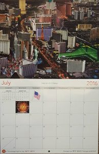
I was immediately struck by the High Roller, almost in the center of the Strip. That “Vegas Comfort” moment (you know, when you dream into the glossy 50# double-sided paper of your favorite place and imagine yourself in the middle of it) washed over me like a wave of goodness. I pleasantly recalled my recent trip and my ride on the High Roller and my wife’s newly discovered fear of hights.
As I lost myself further into the photo, something didn’t look right.
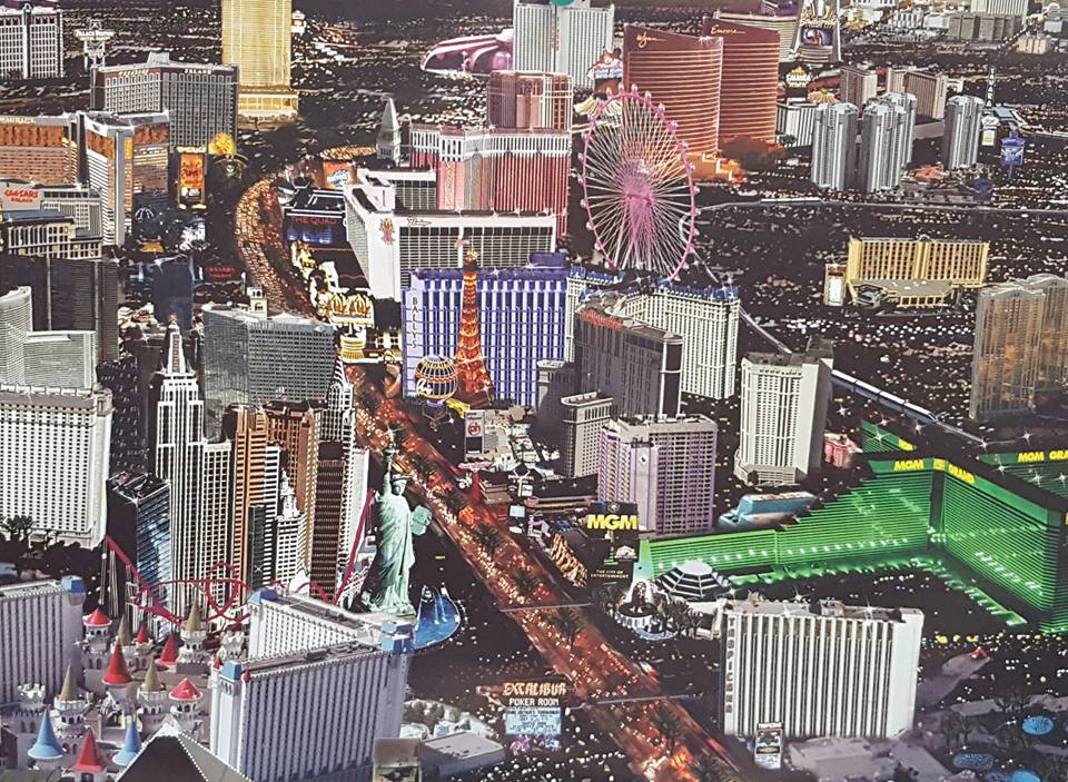
I noticed that the old Bill’s Gamblin’ Hall neon was present instead of the current Cromwell’s un-neonness. “Hmm,” said I. “The High Roller was not in operation when Bill’s Gamblin’ Hall closed.” Upon additional review, I noticed that the Venetian hotel tower was inside Flamingo’s courtyard, and that wave of goodness became the chill of horror.
This Las Vegas doesn’t even exist. Suddenly, like a Vegas Obsessed while watching a movie filmed in Las Vegas, I began to point out to myself every inaccuracy. I didn’t write them all down, but there are many of them.
So let’s play a game. Click the image above for the larger version, then, everybody pick one or two inaccuracies and list them in the comments below. Many will be very easy, but many others can only be spotted by significantly zooming in on an area. I’ll give an example… The sign on the TI has the pirate. Like I said, I didn’t write any of them down, so I don’t have an answer key. But let’s see how many we can find.
[Photos: Michael James]
Michael James is a true Vegas Nerd. First falling in love after hearing details of an aunt’s visit in the ’70s, and nurtured when the gambling bug hit as casinos started opening on every street corner across the country in the ’90s. When not reading Vegas blogs and message boards, he’s a metals buyer by day and a competitive bowler by night in Milwaukee.
28 thoughts on “Vegas Gift Calendars: When All is Not as It Seems”
Comments are closed.
I’ve noticed a bunch of mistakes but one of the most obvious is that the Sahara is still shown instead of SLS.
Notice the vertical Sahara sign is at the back of the property, too.
Somebody turned the Excalibur. Statue of Liberty is huge. I could go on…and on…
The Stratosphere sure looks close to everything…
Excalibur is facing south
I didn’t even notice that one, though two of the first four commenters saw it.
I don’t see any of Bellagio or the fountains…but maybe you wouldn’t be able to from this angle?
Linq is still The Quad. Most glaring is Hilton Grand Vacations by PH isn’t there, on the plus side it does give shout outs to Palace Station and the Westin
It’s called “poor photoshopping”…..I’ve seen it many times in Las Vegas—especially on postcards. Someone tries to cram in as much Vegas as they can into one shot. A real photographer would use a proper telephoto lens and position himself/herself to capture a real angle. Clearly this company/individual doesn’t even know their Vegas history if they are cropping/pasting images from different time periods (SLS vs Sahara…….Bill’s Gamblin Hall vs Cromwell etc)…..and notice how all the parking lots and garages have been reduced or eliminated?? It looks like you could step out the door of Excalibur and be right inside NYNY without even crossing the street!
Grade F-…..
Monte Carlo is behind NYNY
Not a single porn slapper on the strip!
An entire wing of Paris is missing. Bally’s has been reduced to one tower. Most of it is missing. Guarantee this is a file they have been using for years and the just update sections as they see fit.
MGM Grand hasn’t been “The City of Entertainment” for about 5 years now. Thank you, Vegas Bright for making me obsess over this today. I am sure I am not the only one who tries to “date” shots of Vegas when they come on TV.
Nobody has mentioned the “old” Tropicana logo and non-blinding-in-the-desert-sun-white paint job.
i get it, but I didn’t want to analyze and criticize too much. they wanted to cram in as much as they could and they did a good job of that — after distorting things. it makes a great colorful calendar for $1.97, but not too accurate. maybe they intended to mix in some old and new? maybe they think everyone in Vegas is too drunk to recall thinks accurately? who knows, but I will be there in august and probably buy one for 2017.
correction; THINGS not thinks.. lol
But analyzing and criticizing things is what the internet is for, isn’t it?
Monorail is running on the outside of the High Roller, not on the inside close to the casino
Nice one!
The ugly apartments/condos next to Aria are missing
What happened to the Cosmo?
The Trump tower is now on the Strip.
No Elara behind Planet Hollywood
Here are two more…. (1) The sun appears to be shining on the left side of the Excalibur, and (2) It looks like neon flames are on the building above the Bill’s Gamblin Hall neon. At first I thought it was the old Sundance entrance, but upon further review, that’s not it.
http://museumofgaminghistory.org/pics/sundance.jpg
Wynn and Encore look conveniently rotated to show off the names.
Fashion Show Mall is missing. The street on the southern end of strip appears to be slanted, with palm trees coming straight out of the cars. The long walkway to Ballys was removed, and the casino was moved closer to strip.
I can’t see a wing of Tropicana & no Arch at Paris
The one that sticks out at me the worst: Wynn is shaped wrong. The apex of the roof is on the correct (west) side, but the concave side of the building should be facing us, not the convex side. And the whole thing then needs to be rotated so the convex side points more toward Treasure Island.